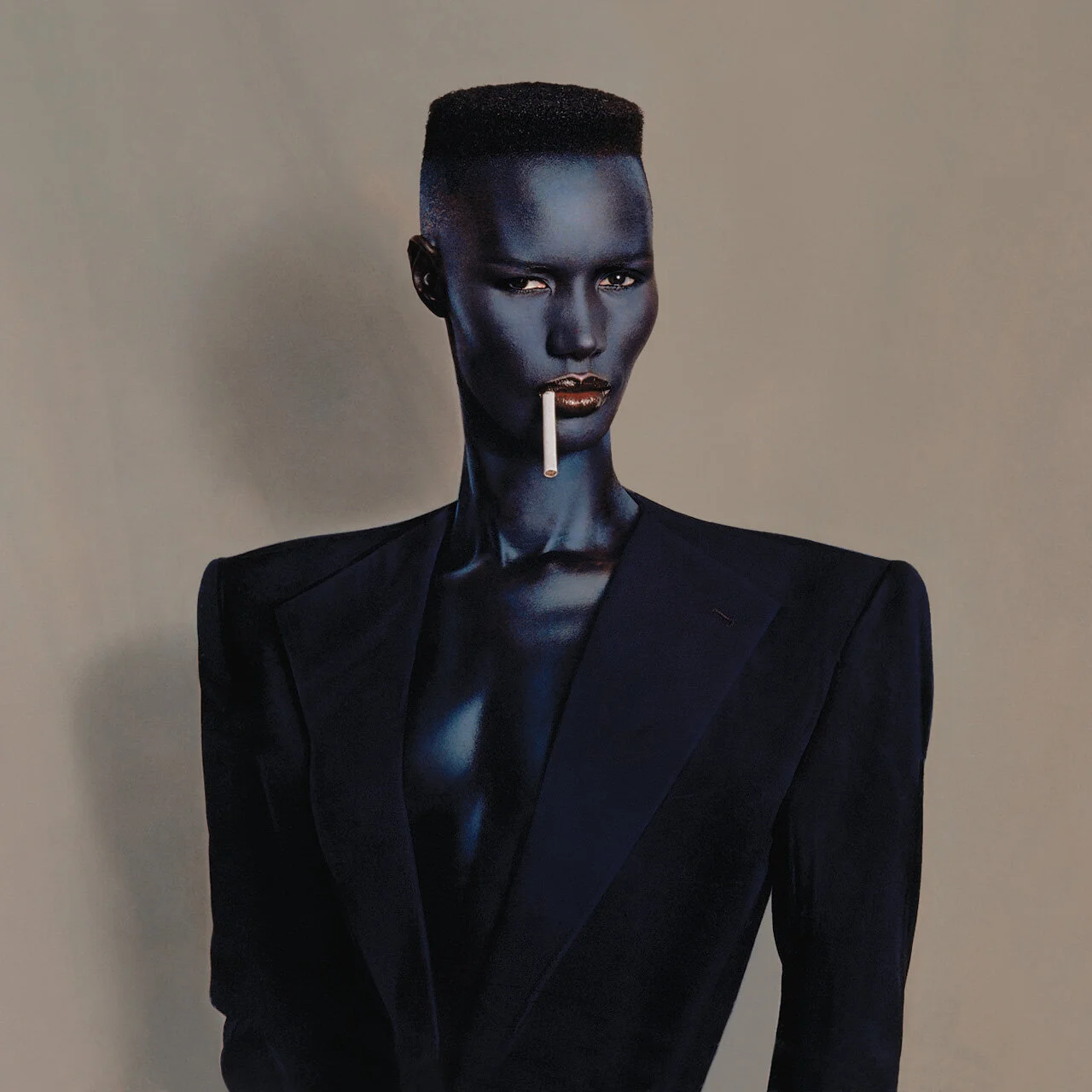
When I first entered the hall, I saw a wall on my right and noticed illustrations of the female body. At a first glance, I noticed the nudity. From the second look, I was trying to figure out if all the illustrations were of women. Because of the implicit bias that has been - unfortunately - embedded in me by society, I initially thought the last columns on the left and right ends were of men. Three illustrations on the very left column show three people in blue skin, and the beard and well-built muscles suggested they were men. One the other hand, pictures of the very right column are all in pants suits, which prompted me to think they were men as well based on the stereotype that pants suit and short hair are for men. Nevertheless, when I looked at the overall picture with all the illustrations, explicit female nudity hyper sexualized and denoted the femininity of the entire scheme of that wall. Only then, I was able to look closer; the details of each illustration’s bodyline and the miniscule details in the facial features: every illustration on that wall is of androgynous females.
It was interesting to see how different images put together can have an impact on one’s perception of things. Because of this first installation, I was able to approach all of Goude’s work with the proper perspective, especially the Grace Jones section; an iconic pop singer and Goude’s ex-partner. In most of her pictures, Jones has a deep blue skin and is edited to have a sharp hairline and facial features and an athletic body to bring out the traditionally more masculine look. It became clear, however that he was embracing androgynous femininity and trying to appreciate its beauty.


