
Alegria, A Love Affair Between Big Tech And The Art World
In recent years, there has been an overwhelming omnipresence of a certain style of corporate art style dominating our loading screens and home pages. Back in 2017, Facebook rolled out a series of fresh illustrations that complemented its content all throughout its site. The most typical illustration depicted flat people with oddly disproportionate bodies, long arms, and colorful skin tones. This has become the go-to aesthetic for corporations, including Facebook, Google and Airbnb to name a few.
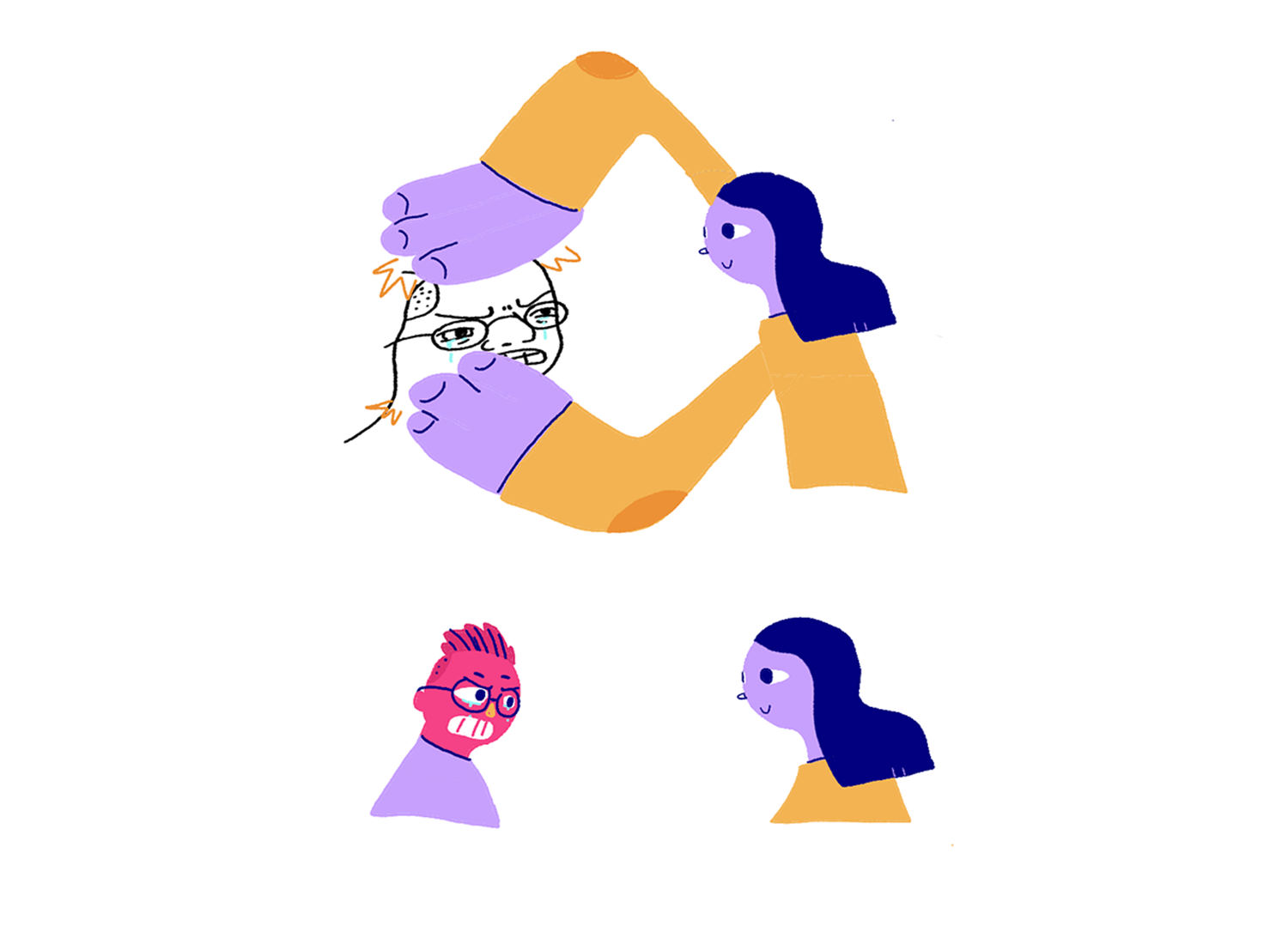
This style of illustration is by no means new. Its rooted in modernism, and parallels can be drawn from art deco posters in the early 1920’s and 30’s. Graphic design has been on a flat geometric route for quite some time, and this art style can be seen as a natural progression from that. Initially, this illustration system was created by an L.A. based design agency – Buck – for Facebook. This art form, consisting of aggressively happy characters, has come to be known as ‘Alegria’. As a result, Facebook has come to be rather closely associated with this style, but they’re not alone. As previously mentioned, companies like Google and Airbnb have been in on this style too. It seems as though corporations see this visual language as one that signals positivity and connectedness between them and their consumers.
Big tech corporations have adopted this style of illustration speedily for many reasons. It is serviceable. There is a lot of utility in it. These illustrations are simple, easily scalable, easy to animate and if need be, replicate. Taking Facebook as an example– this distinct feature of Alegria would allow multiple artists to work and contribute to a large project such as the Facebook illustration system whilst still maintaining the overall look of the characters. If we were to exit the deep-pocketed sphere of big tech, the same logic applies elsewhere. Dwindling budgets and shortened timelines are both drivers towards minimalistic design and illustration.


Over the last decade, the Internet has become increasingly animated and visually appealing. As such, this has become the go-to aesthetic for several corporations that have become more and more reliant on such illustrations to fill their websites and white spaces. Despite its undeniable perks, there has been underlying cynicism for this specific art style. It has become synonymous with big tech corporations. These characters are designed for expression and not individual identity. One of the lead designers at Buck called them ‘ethnically non-specific to represent diversity’. But how true is that? With pastel skin tones and unhuman like bodies– corporations have tried to promote inclusion and diversity by seemingly including everyone and no one at the same time. People have come to resent its lack of innovativeness and repetitiveness. These illustrations have been overused, as their fundamental make up allows for a large number of iterations to be made to service the whims of the corporate clientele at a faster rate. All these factors combined come together to form an array of styles that look rather homogenous.
Every trend has a shelf-life, and Alegria is no exception. The pressure to produce more with less time has given way for these repetitive and unoriginal designs that we encounter in our everyday lives. The style itself cannot be categorized as ‘bad’ art, nor is it badly designed, but it's so overused that it has come to do the opposite of what good design usually aims to - it makes you blend into the crowd.
